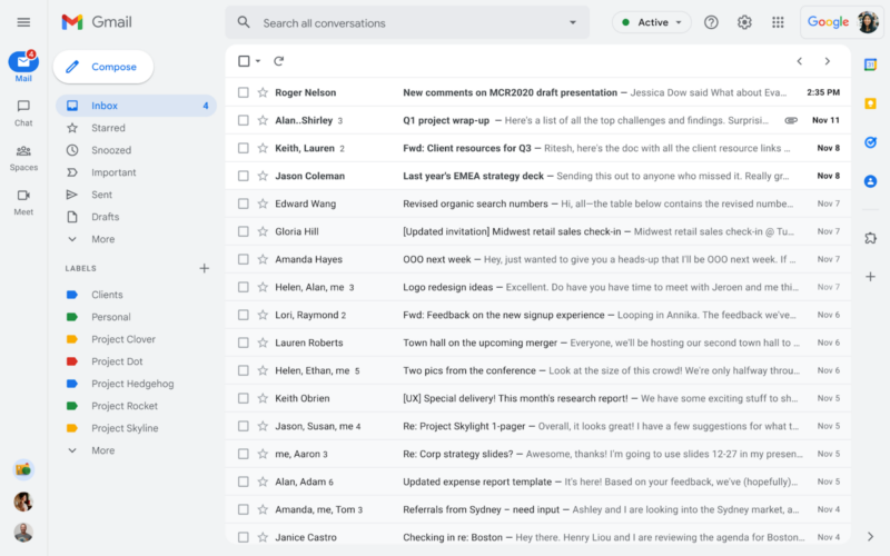
Enlarge / The new Gmail design. It has tweaked colors and an additional sidebar on the left for Google Chat and Google Meet. (credit: Google)
Google will finally start rolling out the Gmail redesign it first showed off last year. The company is calling the interface in the update the "integrated view" because the goal is to integrate Google's latest messaging service, Google Chat (a Slack competitor and the successor to Hangouts) and Google Meet (a Zoom competitor) into Gmail. The main section will remain mostly the same, but there are plenty of changes coming to Gmail's navigation sidebar.
Currently, the Gmail sidebar houses the sections you would expect, like the Inbox, Drafts, Trash, and your list of labels. The redesign will add a second, new higher-level navigation panel to the left side of the page, letting users jump between Gmail, Google Chat, Spaces (Google Chat group chats), and Google Meet. Besides the four app-navigation options, the new sidebar also has a stack of icons at the bottom, and it's not entirely clear what they are. They look like chat profile pictures, so they could be either active chats or starred contacts. Since no one has tried this interface yet, we don't know many details.
Google's blog post has a detailed timeline for the rollout. Starting next week, February 8, the new interface becomes opt-in, and you can revert to "classic Gmail" in the settings (Google notes the update will take 15 days to roll out to everyone). In April, users will be automatically enrolled in the new interface. By "the end of Q2 2022," the interface will become the standard for Gmail, with no option to use the classic interface. Google says there will also be a "new streamlined navigation experience on Chat web (mail.google.com/chat)," which I assume means you'll get a similar sidebar setup where you can jump to Gmail right from Google Chat.
Read 5 remaining paragraphs | Comments
from Tech – Ars Technica https://ift.tt/F5l61tUOa
No comments:
Post a Comment